NONNA
A brighter take on Italian pasta tradition
Nonna brings familiar pantry staples to life through expressive typography, bold color, illustration, and packaging—creating a visual system that feels nostalgic, energetic, and unmistakably its own.
ROLE
Visual Designer
2023
SCOPE
Brand Identity · Packaging · Web
DELIVERABLES
Packaging · Website · Social · Merchandise
Visual Direction
Familiar ingredients. A fresh visual language.
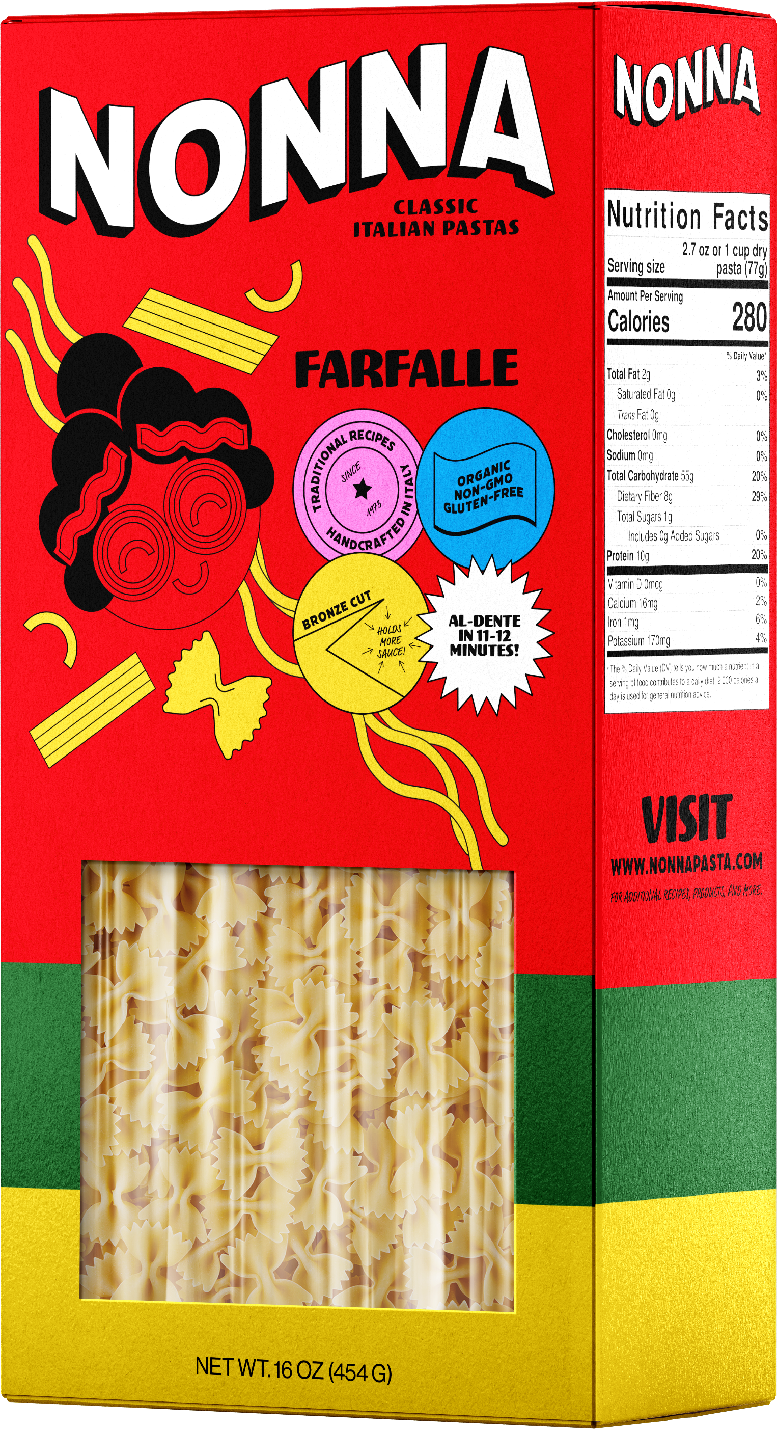
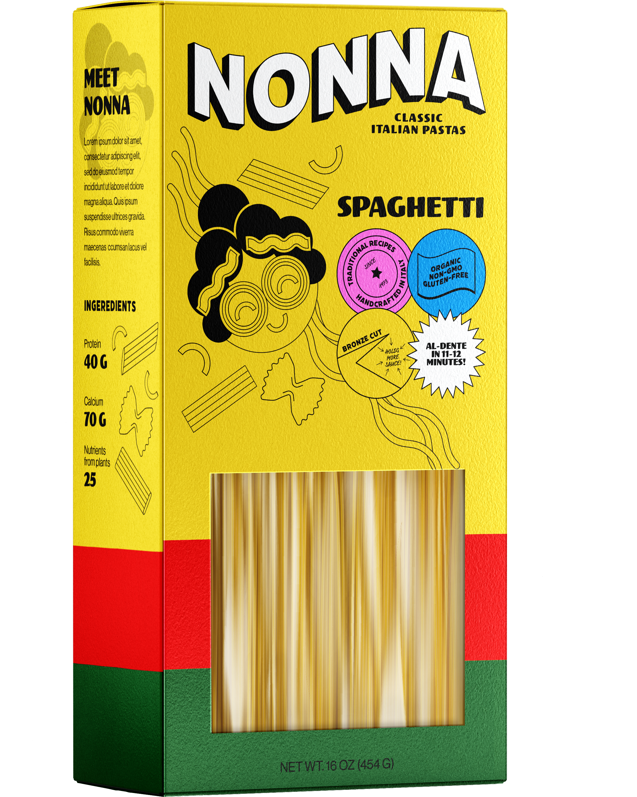
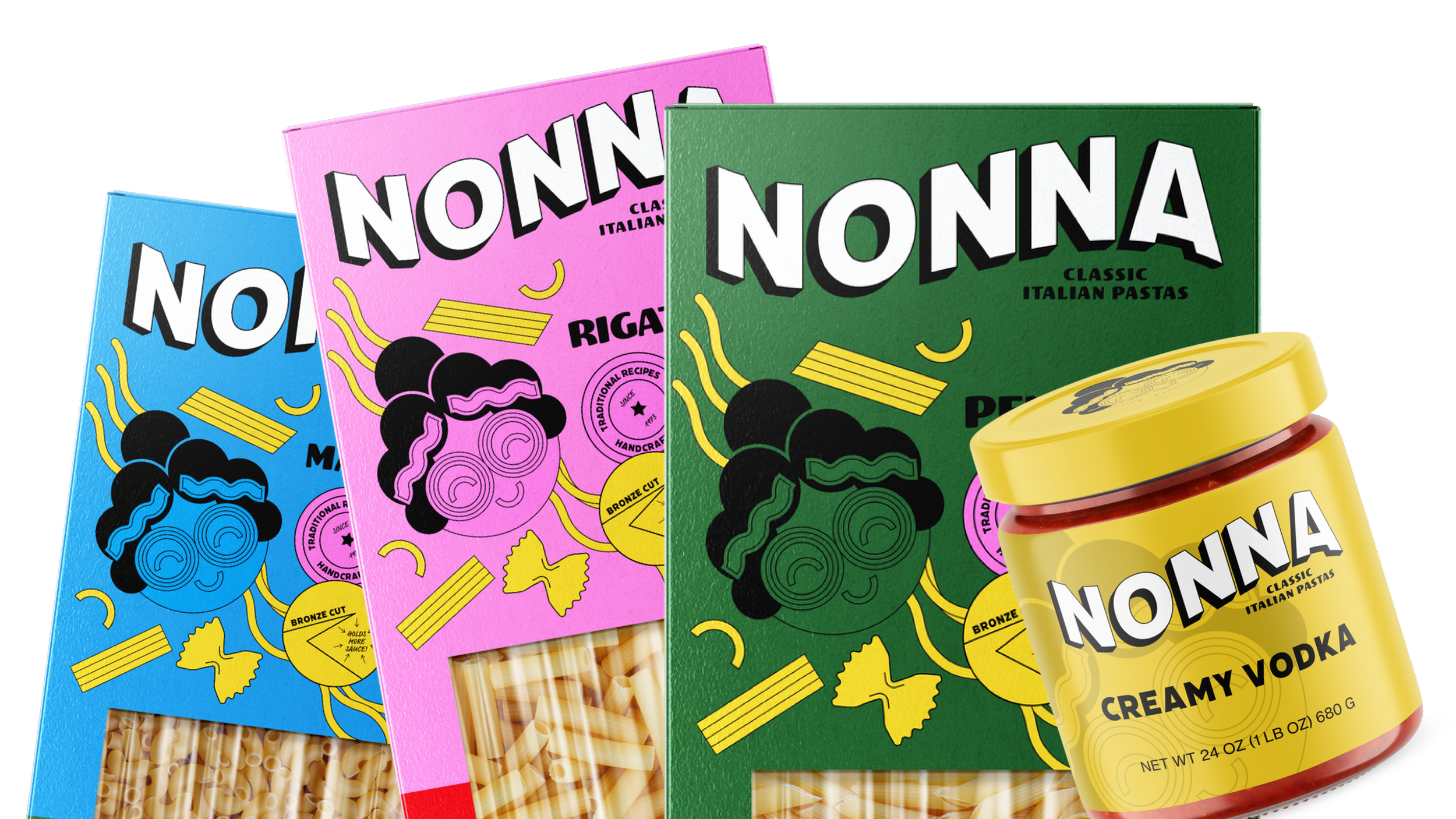
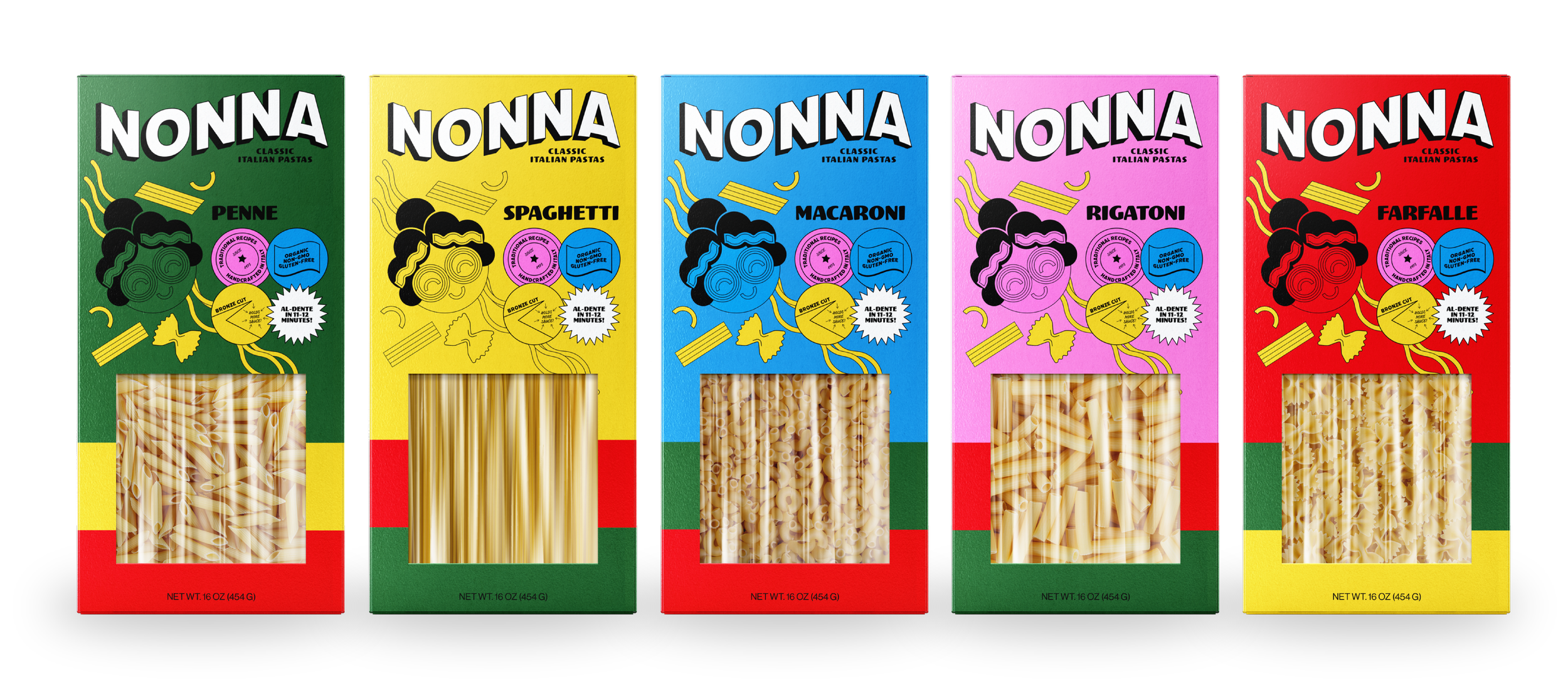
Oversized typography, saturated color, hand-drawn pasta forms, and an illustrated Nonna character create a system rooted in familiar Italian food culture without relying on traditional heritage-brand conventions. Each product takes on its own personality while remaining part of one recognizable family.
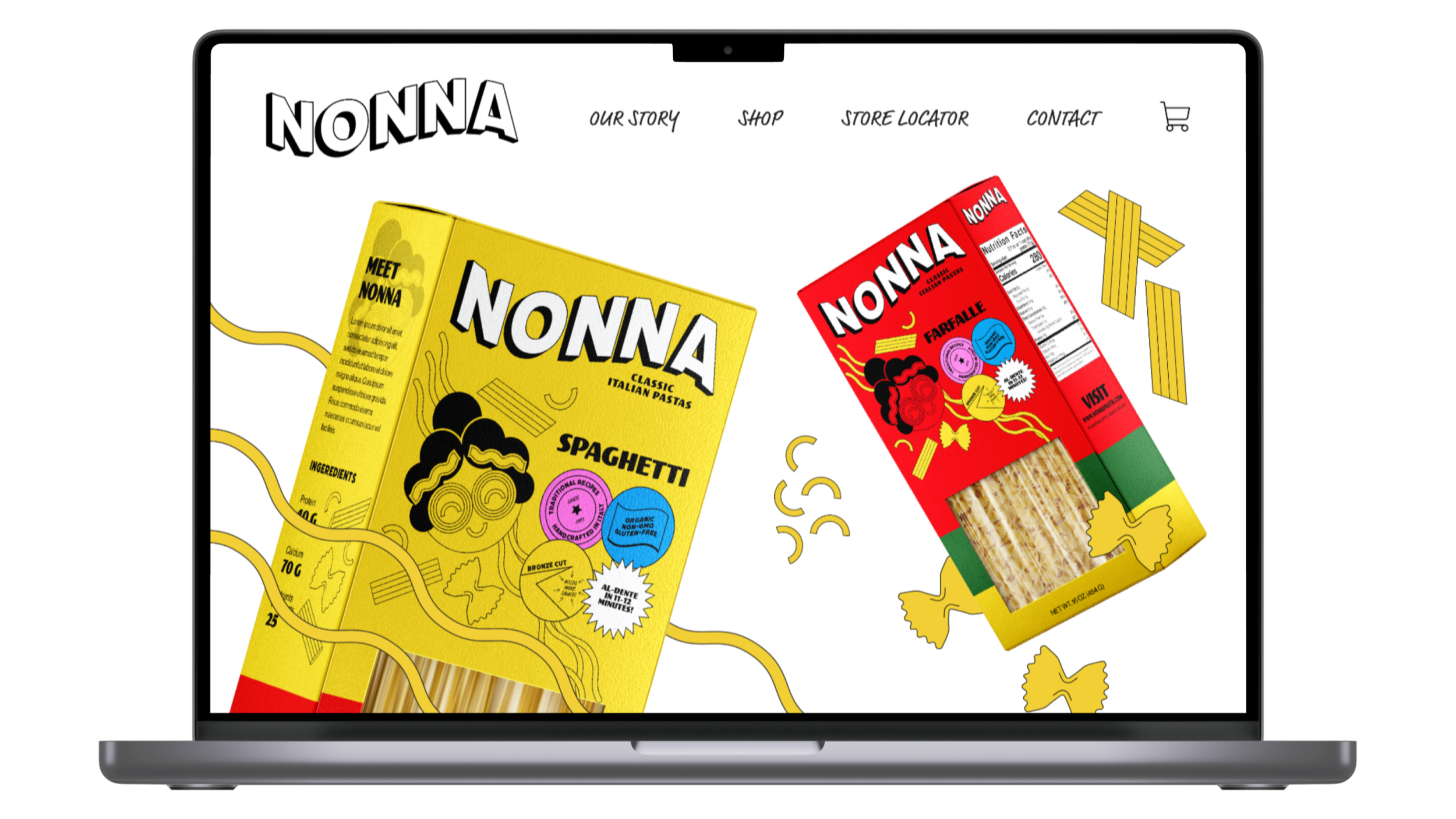
Web Design
Bringing the packaging system to screen.
The website carries Nonna’s bold visual language into a responsive digital experience through oversized type, product-led layouts, expressive illustration, and blocks of saturated color. The system keeps the packaging at the center while giving the brand room to feel just as playful online.





Brand Extensions
Bringing Nonna into the kitchen.
An embroidered apron and engraved wooden spoon extend the identity beyond the shelf, turning the brand’s character and illustration into objects made for the everyday ritual of cooking and sharing food.