coffeebar

The Coffeebar mobile app improves the coffee pickup experience by helping customers order quickly, customize drinks easily, and accurately plan their pickup time. The app prioritizes efficiency and transparency so users can spend less time ordering and more time moving through their day.
Project Overview
My role: Visual Designer, UX/UI Designer
Date: 2023 (4 months)
Scope: Mobile app

The problem
Coffeebar, a Northern California coffee chain, lacks a dedicated mobile ordering experience. Customers must either order in person or navigate a cumbersome third-party ordering system.
This creates friction for loyal customers who value speed and convenience. Without a streamlined ordering process or accurate pickup timing, customers often spend more time ordering than expected and risk delays due to unpredictable wait times.
The goal
Design a mobile ordering experience that matches the quality of Coffeebar’s products. The app should streamline ordering while introducing features that improve transparency, customization, and pickup timing.
User Research
I conducted user interviews with participants aged 20–45 who regularly purchase coffee from Coffeebar locations. The research focused on understanding ordering habits, frustrations with existing systems, and expectations for mobile ordering.
From these insights, I developed user personas, journey maps, and a competitive analysis of existing coffee ordering apps.
KEY INSIGHT
The research revealed a strong association between coffee ordering and productivity. Users want to minimize ordering friction and better predict pickup timing so they can move efficiently through their day.
Participants consistently preferred selecting pickup times up to an hour in advance rather than immediate pickup. Scheduling ahead helped them:
Order before leaving home or work
Align pickup with commute timing
Avoid in-store waiting
Feel confident their order would be ready
This insight led to prioritizing flexible pickup scheduling with advance time windows, rather than defaulting to ASAP ordering.
PAIN POINTS
Third-party Ordering System
The current system feels disconnected and cumbersome, leading users to default to in-person ordering
Repeating Orders
Users must manually rebuild drinks each time, slowing the process
Unclear Pickup Timing
Consumers lack guidance on how long orders will take and when they need to leave to meet their pickup time
In-Store vs. App Disconnect
Promotions are advertised in-store but not reflected digitally
USER FLOW
Initial user flow based on key pain points identified during research.

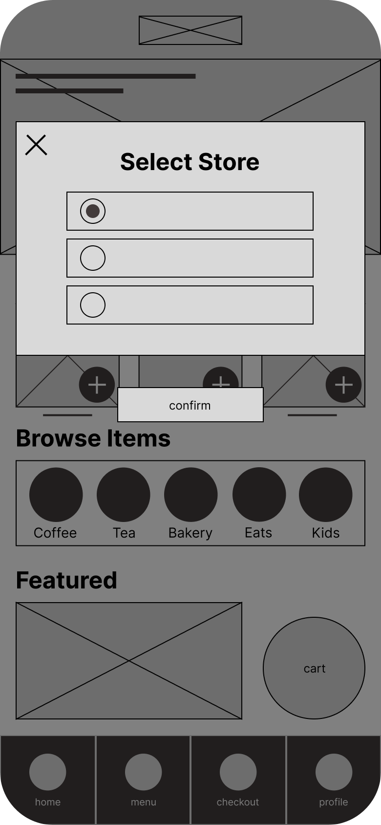
DIGITAL WIREFRAMES
Digital wireframes explored a streamlined approach to coffee ordering, allowing users to build drinks quickly while maintaining flexibility for pickup customization.
Initial concepts placed store selection and pickup timing within the ordering flow, keeping the early experience focused on quickly building an order. Estimated pickup timing and location details were refined as users progressed through the flow.
LOW-FIDELITY PROTOTYPE
The low-fidelity prototype models the primary user flow of building and submitting an in-app order with pickup customization.


USABILITY STUDY #1
Type: Moderated usability study
Participants: 5
Length: 30 minutes
Location: Remote, United States
Participants were asked to place an order within the app while sharing their thoughts and reactions. They also rated task completion and overall ease of use. Observations were grouped using an affinity map to identify patterns and key insights.

Key Findings
A simpler starting point…
The usability study revealed a sense of overwhelm on the homepage. Users were unsure where to begin and confused by menu items surfaced on the home screen.
To address this, I:
Renamed “Menu” to “Order”
Removed the “Browse Items” section
Elevated Rewards to a primary feature
Promoted pickup details into a main action
These changes clarified the starting point and simplified the ordering process.

BEFORE USABILITY STUDY #1
AFTER USABILITY STUDY #1

Pickup timing confusion
Users were unsure when their order would be ready or when they should leave. Pickup time selection felt buried in the flow, making it difficult to plan ahead.
Split pickup controls
Store selection and pickup timing were handled separately, creating friction and forcing users to backtrack during ordering.
To address this, I:
Surfaced pickup details earlier in the experience
Combined location and timing into a single editable module
Allowed users to update pickup information without interrupting their order

BEFORE USABILITY STUDY #1

AFTER USABILITY STUDY #1
Hi-Fidelity Prototypes


Outcome
The final designs deliver:
Faster ordering
Reduced friction in drink customization
Clear pickup timing visibility
Unified pickup location and time controls
Improved transparency throughout the flow
The result is a more predictable and efficient coffee pickup experience aligned with users’ productivity-driven workflows.