


COFFEEBAR APP
Project Overview
THE PRODUCT
The Coffeebar app is designed for the on-the-go coffee-lover who values quality coffee at a matched convenience. The product allows users to tailor their coffee experience to their schedules with full customization options from drink to pickup.
PROJECT DURATION
4 months
MY ROLE
UX Researcher, UX Designer, UI Designer, Brand Designer

THE PROBLEM
People make time for coffee, but coffee doesn't reciprocate. With various coffee chains and local cafes employing different mobile systems (or lacking them altogether), on-the-go adults with tight commutes and a routine caffeine consumption need a more efficient coffee pickup process that's simple and stress-free. This way, they can focus on maximizing their days and minimize unnecessary attention and negative experiences associated with ordering coffee.
THE GOAL
Minimize the thinking and planning involved in coffee ordering by providing users with the ability to customize their coffee fully and ensuring transparency. Additionally, grant access to details regarding pickup.


User Research
Summary
My user research involved interviewing individuals aged 20-45 to assess their experiences with ordering coffee. Subsequently, I crafted user personas and journey maps to gain a comprehensive understanding of my users and empathize with them. Additionally, I conducted competitive analysis to gain perspective on current gaps in mobile ordering apps.
The outcomes of my research confirmed that users strongly associate coffee ordering with concepts of productivity and time. This connection emphasizes the significance of efficiently preparing coffee to align with users' daily routines, highlighting their perception of coffee as a crucial element in enhancing productivity and thus the need for the process to be productive in and of itself.
PAIN POINTS
Different Ordering Systems
Without a dedicated mobile app, customers have to consider third-party or in-person ordering options that take up more time.
Manually Repeating Orders
Regular customers frequently face the tedious and, at times, complex task of manually inputting information, depending on their preferences and dietary needs.
Assessing Travel Time
Current systems do not account for store business, making it difficult for customers to assess their coffee pickup.
In-store vs Online Indescrepencies
Users are often surprised by new offers and deals upon arriving at the store, and their orders accordingly.
USER FLOW

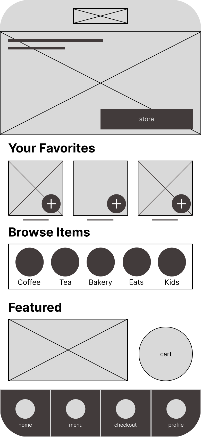
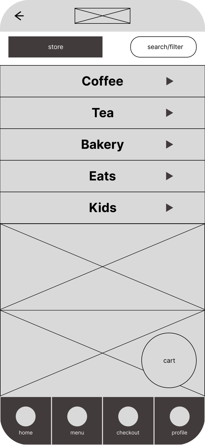
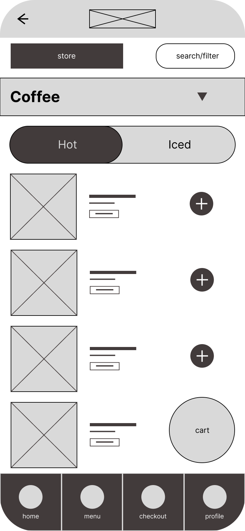
DIGITAL WIREFRAMES
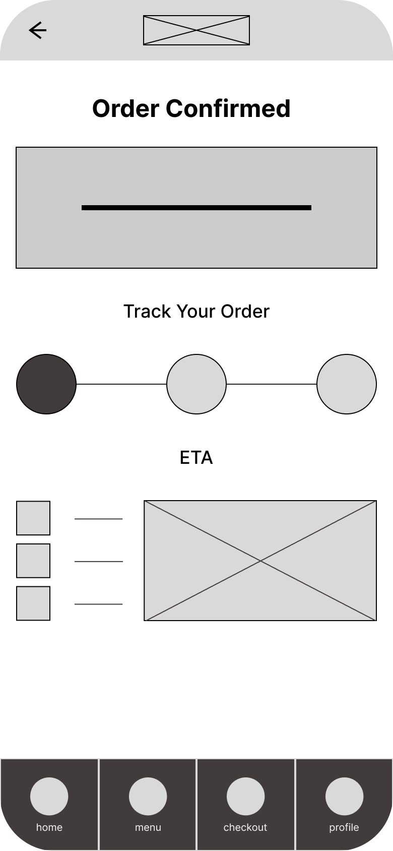
The goals of the wireframes were to establish a linear approach to coffee ordering, providing users with options to modify pickup preferences seamlessly. Users can add their favorite items, browse through item categories, and change the pickup location directly from the homepage. Based on the paper wireframes, I integrated the estimated time of arrival with the store pickup location feature for a more consolidated and user-friendly experience.
LOW-FIDELITY PROTOTYPE
The low-fidelity prototype connected the primary user flow of building and submitting an in-app order, enabling its use in a usability study with users.


USABILITY STUDY #1
Study type: Moderated usability study
Location: United States, remote (users go through the usability study in their own homes)
Participants: 5 participants
Length: 30 minutes
I asked participants to place an order within the app, noting their thoughts, feelings, and opinions on their experience, and rating their ability to complete the task and the ease with which they were able to do so. I sorted my notes into groups using an affinity map, allowing me to establish a foundation for insights.

A simpler starting point
The usability study revealed a sense of overwhelm on the homepage. There was some confusion regarding menu items residing on the homepage and where users should begin the ordering process. I made some changes to the icon naming, changing “menu” to “order” and also removed the “Browse Items” section, replacing it with Rewards, which users consistently conveyed was a valuable mobile ordering feature. This feature was initially tucked into the profile page until I made it a core feature of the app. Lastly, I made the pickup info a main button with full info so that users could change their pickup details in tandem rather than changing them independently, simplifying the pickup details process.
Before Usability Study #1

After Usability Study #1

Streamlined customization
I initially had users change the store from the homepage and the time only when they were selecting an item. This led to some confusion duing the usability test, so I created a screen that allows for the editing of pickup location and time across all pages, while providing geographic pickup infromation and the transportation times for different modes.
Before Usability Test #1

After Usability Test #2

